
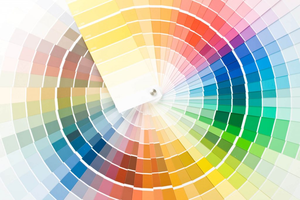
CMYK, RGB, HSL, Hex, PMSu PMSc? Welcome to the world of colour. These are the main colour systems available to you when choosing a colour and that’s before we get onto Dulux colour swatches! So when choosing colours for your Brand where do you start? Well, you can always ask the Managing Director’s wife as that’s what you will probably end up with but assuming you have some autonomy lets look at what your options are.
What Colour Says About Your Brand
Colour should not just suit your design but reflect the message you are trying to portray for your brand. Paint manufacturers spend a fortune breaking colours down into groups of Warm, Cool or Neutral. Attached to these colours are the perceptions they have on our mood.
Warm colours are perceived as lively; red is vibrant and bold, orange friendly and creative and yellow is playful and creative. Cool colours are more associated with nature; green suggesting environmental concern, purple is spiritual and quirky (although purple is also the colour of mourning in some far east cultures). Blue suggests trustworthiness and reliability. This leaves us with the neutral colours of black, white, grey and brown. Whilst black and white portray solidity and purity respectively. Browns are associated with age, heritage and earthiness whereas grey is just seen as calm but depressing!
This is borne out with the fact that many of the major corporations of the world will use warm or cool colours in their logos to make a statement. Macdonalds, Virgin and Coca-cola primarily use red or yellow (or both with Macdonalds) whereas the dependables such as IBM or Ford stick with blue whilst black keeps the likes of Mercedes Benz and the World Wildlife Fund firmly in the solid category.
Of course there are variations to this and many companies will use a variety of colours to match their diversity, I’m thinking Google here, or a mix of moods using a second colour to accent particular aspects, particularly on websites where many background colours are of the neutral camp with the accent colours of warm or cool colours, being used to add emphasis to the content.
How We See Colour
Before we start picking colours lets first understand a bit about colour and how we see it. In simple terms colours models are either Additive, colours with lights, using Red, Green and Blue (RGB) or Subtractive, colours with pigments using Cyan, Yellow and Magenta (CMYK).
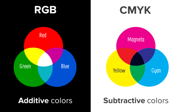
The graphic shows how these work. Add equal quantities of RGB you will produce white, take away and you end up with black. The opposite is true of CMYK colours.
Humans have three colour receptors in their eyes each being reactive to either red green or blue. Therefore we can perceive 16.8 million colours. Computer graphics, websites and most digital devices will work in RGB mode. Giving us the wonderful spectrum of 16.8 million from which to choose our brand colour…I’m afraid not. If you value any form of consistency in rendering your corporate colour, you will never do so digitally.
Consistent Colour
No two devices, unless constantly calibrated to the finest degree, will ever reproduce colours the same using RGB. As printers and designers we’re well used to the the call “it looks different on my screen” from lesser informed individuals. The bottom line is you cannot choose your colour from a screen.
To avoid disappointment and to give yourself every chance of having consistent colour over a wide selection of mediums use the CMYK model for your brand. The choice is narrowed down but you still have 65000 colours to work with!
Even if you consider yourself a totally digital company at some stage (whether it be a business card, signage, packaging or promotional gifts or corporate clothing,) you are going to want to reproduce your brand in print of some form. Therefore you should ensure that when designing your logo and brand you pay close attention to the Pantone Matching System (PMS).
Pantone Colour
Pantone is a major system which covers European, North American, Asian colour standards plus non process colours for fabric dye, dye sublimation, paint colour system and screen print. Your designer or printer should have the appropriate swatch for you to select from. These can show you faithfully how your colour will reproduce in full colour or in spot colours and how different substrates will affect your colour.
The rapid raise of digital printing technologies now makes short run print viable and affordable. Therefore you should pay close attention to how your logo will reproduce in a four colour process (the heart of digital print.) This again can be admirably catered for with the pantone system. You need to know that there is no point in selecting, say vibrant bright orange as your colour only to find out that when printed in CMYK four colour it looks a very sorry shade of dodgy brown. Instantly the impact of your brand goes from lively and cheeky to staid and old! The pantone system will give you values you can use with your printer (CMYK) and your web team (RGB and Hex values) and the system is probably worthy of its own blog.
Brand consistency is so important in a competitive market. The worlds top brands closely guard their brands and go to great lengths to ensure their image is accurately and constantly reproduced like Coca Cola and Apple. So if its good enough for them it should be a top priority for you!
Tell Me More…
If you’re about to write your new design brief, take a look at our essential checklist. As part of our design mini-series, we’ve also got a blog all about creating a great logo.
Still hungry for more? Why not check out some of our past design work here